State Bank of India
Redesigning a Banking Application for Enhanced User Engagement
Yono, the state bank of India's banking app re-designed pushing boundaries to deliver optimal solutions, crafting unparalleled user experiences, and fostering heightened engagement on the platform.
USER RESEARCH
Banks user expectation and vision
This explains why the bank needs to enhance engagement on the platform.
1
Expand customer base
2
Advancing loans
3
Growing deposits
Who are the users engaging ?
Compared to Generation Y, Generation Z (those born between 1997 and 2012) bring higher engagement to the platform, particularly on mobile devices.

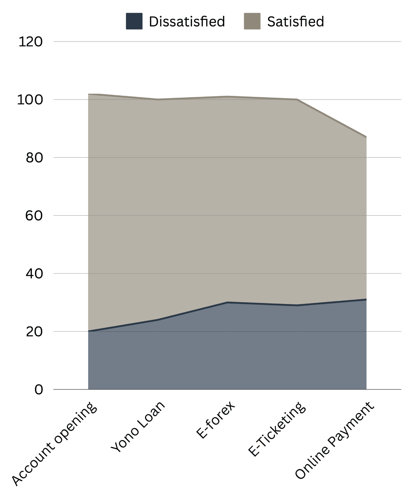
The analysis and interpretation of the study on Customer perception towards YONO SBI mobile banking services is presented based on the opinion of sample of 120 respondents selected from saravanampatti (district in tamilnadu) through a questionnaire containing 26 questions.
Balance Inquiry
Buy goods and services
Aadhaar linking
Apply loans
E-locker facility
TDS Inquiry
Fund transfer
Stop payment check
The study is limited to 100 respondents. Study was conducted to know the customer satisfaction regarding service provided by SBI to the costumers. The present study revolves around the opinions and feedback from the existing customers of the SBI. An opinion survey with the help of questionnaire was conducted to know the users view on the services provided by SBI in Warangal District, Andhra pradesh
Suggested improvement for both pre-login and logged-in users from competitors analysis
Highlighting the chatbox on the app before logging in is crucial. Even though comprehensive information is provided on the app, users may still have queries that remain unresolved

If the user doesn't take any action above and revisits the app in their free time, they are more likely to engage and provide meaningful feedback.

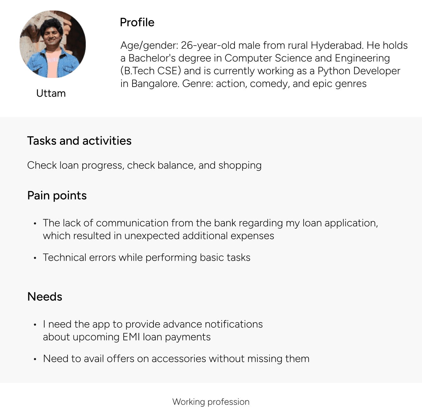
Exploring the Loan Selection Process for a Gen Z Working Individual
Given the bank's goal to expand its user base and advance loans, let's derive a mental model based on the persona. We'll explore how a working individual might go about choosing a home loan
01
02
03
04


User flow: Select a home loan

Journey Mapping(Future state)
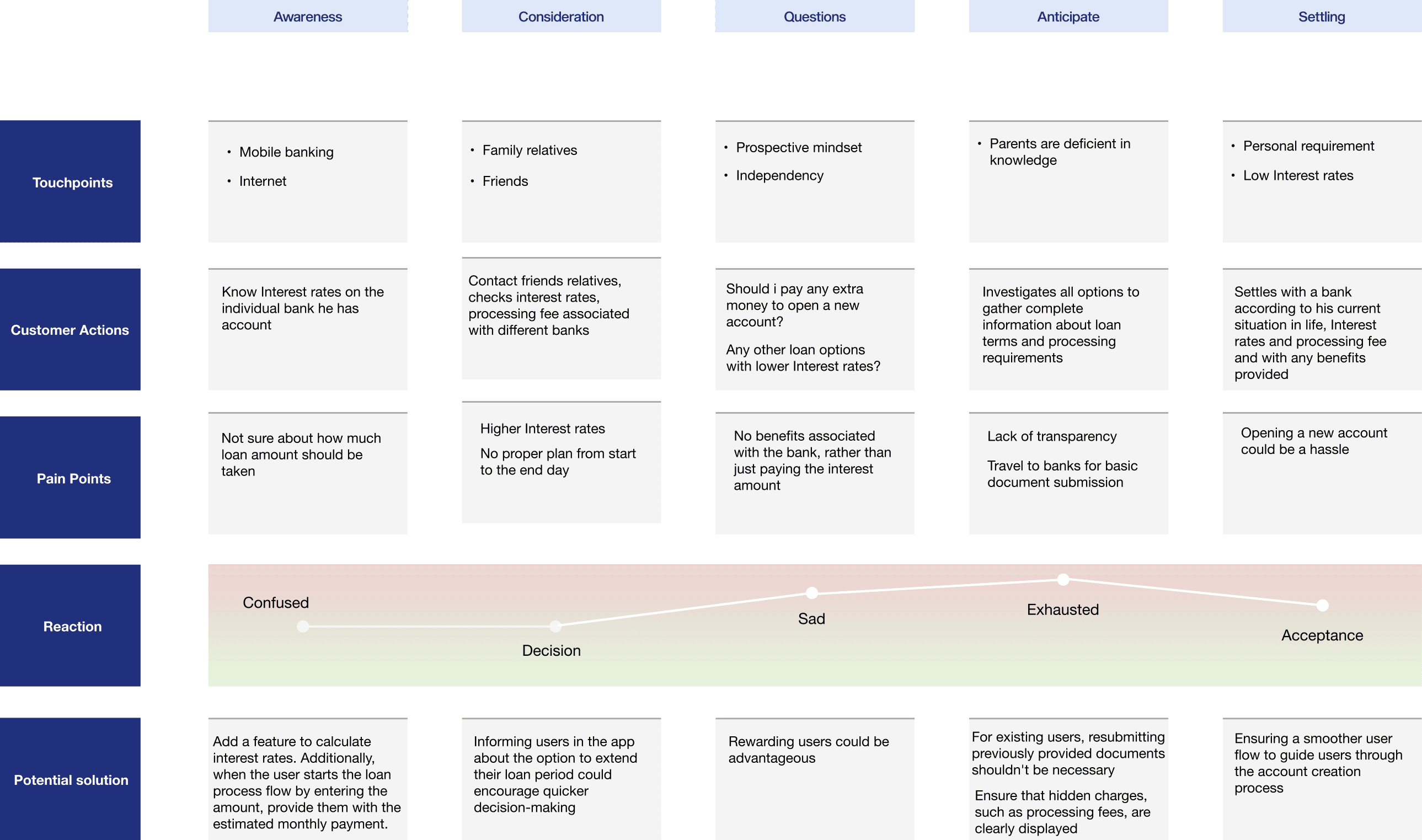
Personal reflections
Not showing the total amount over the loan duration right away can help keep the process less overwhelming and focused on immediate, manageable information. By presenting only the estimated monthly payment initially, users can better understand the immediate impact of their decision without being distracted by the larger, long-term figures. This approach can simplify decision-making and prevent potential sticker shock.
Even if users initially seek a home loan, they might consider shifting to another loan option due to lower interest rates and more flexible terms. This alternative loan might offer a quicker approval process, fewer restrictions on usage, or less stringent documentation requirements, making it a more attractive option depending on the user's specific needs.
User Stories
User story 01
Picture this: You’re on your way to college and realize you’ve forgotten your debit card. When you need to withdraw cash from an ATM, you rely on the cardless withdrawal option
Being a first-time Yono SBI user, I found myself at a loss when it came to cardless withdrawal. Faced with this challenge, I turned to YouTube for guidance and even reached out to a friend who was familiar with the feature. It was definitely a learning experience for me.
Let's begin by understanding how the user can withdraw cash without an ATM card

I conducted physical visits and experiments to uncover the answers to my inquiries
Problem 01: If the user enters an incorrect OTP/ PIN on the ATM, they will need to regenerate both on the app leading to frustration with repetitive tasks
Solution: We're encouraging users to create a new PIN that differs from the one used in the previous transaction. Instead of asking them to create another new PIN each time, users will have the option to reuse the existing PIN.
If the user revisits the app shortly after (within 5-10 minutes) and initiates the withdrawal process again, a pop-up could appear with the message, "Proceed using the old created PIN.

Here are two scenarios I can envision for the reason behind setting a 4-hour validity period for the OTP

Suggestion based on scenario 01 & 02
The user needs both a PIN and an OTP to withdraw cash. After creating the PIN, we present two options: withdraw cash now or later. If the user selects 'later,' an active notification will be maintained, stating, "Cashless withdrawal has been initiated. Click here to generate an OTP whenever you're ready to get cash." This also serves as a helpful reminder of the process they've initiated.
Depending on the data on how many people are withdrawing cash immediately or at a later time, we can analyze how many users are utilizing the 4-hour valid OTP at different intervals, such as 4, 3, 2, or 1 hour before expiration. With this data, we can maintain active notifications for the appropriate duration.

Secondary research(online forums)
Story 01: Four to five loan applications, including car and bike loans, have been processed under my name. I did not initiate or authorize these applications, and I was unaware of them
Response: When the applicant submits the loan application online (without visiting a branch), I recommend to initiate an two OTP’s from the mobile number linked with the user’s Aadhaar card, First will be sent to the bank employee who’s verifying the customer documents. Second OTP will be from the user
Rationale: By implementing this procedure, in the event of a user complaint, we can readily identify the employee responsible for verifying the documents during the loan processing stage, facilitating efficient resolution and accountability.
Story 02: I have consistently raised complaints, yet I have not received any response from the bank thus far
Response: Maintaning two separate portals for handling complaints—one for emergencies to receive immediate assistance and another for general issues. This way, users won't need to resort to online platforms to express dissatisfaction, which could tarnish the bank's reputation.
Story 03: I've been waiting for my ATM card to arrive at my new address after blocking my previous one and applying for a new card. It's been over a week, and I'm concerned about whether the old card has been successfully blocked
Response: Providing real-time tracking updates for ATM cards and access to information about previous ATM cards would alleviate anxiety about card status. This eliminates the need to seek assistance from customer support or navigate through the app to find relevant information.

Examining tasks to improve user experience, focusing on account opening
By understanding business processes, I've enhanced user experience by exploring 09 major flows, driven by engaging factors identified through online surveys
01: Current user flow to open a savings account

Drawbacks & Improvements
Interface 02: Instead of showing NRI or resident in India on one interface, adding a 'Choose Region' screen before those options could simplify the process
Interface 03: Our users are primarily Gen Z and are likely to choose a 'digital account.' However, this option isn't highlighted or accompanied by basic information explaining why they should select it. Additionally, with the heading 'Open Savings Account,' users are presented with options for a digital account or salary account along with a submit button. How will users know they are proceeding with a savings account when clicking 'Submit'?
Interface 04: You don’t display the entire process at the beginning, which can make users feel overwhelmed. Once the user clicks on submit from Interface 03, We create a check box option 'Yes, I’m literate and able to sign' on Aadhaar verification screen because this step often involves critical processes like e-signing documents or verifying identity.
Simplify Interfaces 03, 05, and 06 into a single interface (as shown in the image below): Use the heading 'Account Opening' and display the options from Interface 05. At the bottom left, position a button: 'Frequently Asked Questions'
Account opening
Open savings account instantly through a video call
Recommended
Manual
With or without branch visit options
frequestly asked questions
Final user flow
Interface 04: By displaying FAQs, where users can also access the required documents, only after they select their preferred account type, I ensure they have a clear understanding of the account they’re opening. Presenting FAQs and documents specific to their choice is more effective than showing all three account types upfront, as this approach prevents slowing down their decision-making process.
Interface 05: The checkbox "Yes, I’m literate and able to sign" is specifically added on the Aadhaar verification screen as this step often involves critical processes like e-signing documents or verifying identity

Other user flows
Access and manage e-statements
Access TDS Enquiry
Stop payment cheque
Link Aadhaar(KYC)
Fund transfer through UPI
Bank to bank transfer
Cardless withdraw(yono cash)

Information Architecture
Refining based on user flows, existing architecture, and insights from online user surveys.
Identifying areas for improvement within the existing architecture
Home

Navigation bar
Observations from current architecture
The home screen has too many options without proper categorization
The hamburger icon contains 10 options, but only "SBI Wealth" differs from the rest, which are all accessible on the home screen. Instead, we could place the "Profile" and "Settings" options under the hamburger menu for better organization.
The "NCMC Card" is used for travel, and the feature to book train tickets stands alone. We could categorize both under a "Travel" section for better coherence
The cardless shopping option is currently under 'Cashless Withdraw,' but it would be more appropriate under 'Shop and Order.'
The "Bill Pay" option appears both on the home screen and under "YONO Pay," creating redundancy
The "Get in Touch" option is not intuitive for users who want to raise a complaint. Users might not realize they can report issues by clicking on it.
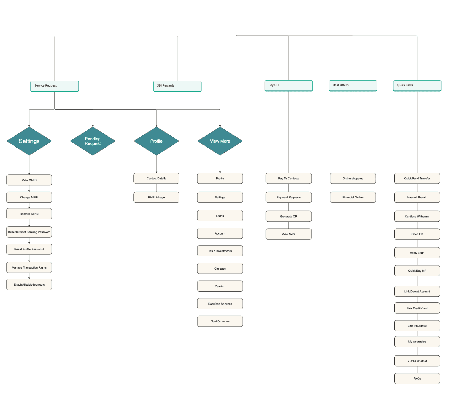
Final Information architecture

Visual representations
I focused on designing uncluttered interfaces to enhance usability, believing this is crucial for improving efficiency, building trust in the app's reliability, and accommodating a diverse user base
The color #103698, a deep shade of blue, is linked to trust, authority, and professionalism, conveying reliability, stability, and security. The depth of this blue also evokes feelings of confidence and calmness, which are essential for users when exploring our products
I chose Source Sans typeface for yono banking app, as it combines clarity with a modern, professional appearance. This font is highly legible, making it ideal for presenting financial information

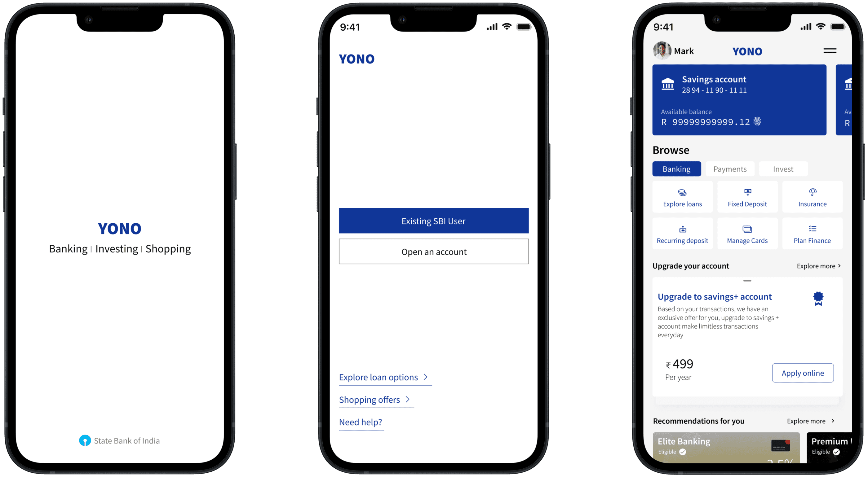
PRE-LOGIN


Thank you! Please get in touch for more info about this project

Thank you! Please get in touch for more info about this project